The Insights page is your dashboard
When you sign in to BitBooks, the first thing you see is the Insights page. Other accounting tools call this "Dashboard." Same idea: a single screen showing the most important numbers at a glance.
The page answers four questions in three seconds:
- Are we making money? (KPI row at the top)
- How much cash do we have, and what do we owe? (Working capital row)
- Where are our wallets sitting? (Wallet snapshot)
- Where is the money going? (Expense breakdown)
The page header
At the very top of the Insights page you'll find:
- The page title: "Insights"
- Notifications bell. Recent activity that needs your attention (new connector imports, period-close reminders, etc.)
- Ledger health icon. A traffic-light status. Green means your books are internally consistent (debits = credits everywhere). Red means something is off and the Trial Balance report can show you what.
- "As of" date. The cutoff used to compute everything on this page. Defaults to today.
- "View reports" link. Jumps to the full Reports page where you can dig into details.
Period selector
Just below the header is a dropdown that lets you change the time period for everything on the page. Options:
- Year to date (default). January 1 of the current year through today.
- Last month
- Last quarter
- Last year
- Custom period. Pick any start and end date.
When you change the period, all four sections (KPIs, working capital, wallet snapshot, expense breakdown) recalculate.
The same dropdown also lets you pick a specific year if you have multiple years of history. Selecting "2024" will show all of 2024.
Section 1. KPI row
Four key performance numbers across the top:
- Revenue. Total income for the period.
- Cost of sales. Direct costs of producing what you sold.
- Gross profit. Revenue minus cost of sales. The profit before overhead.
- Net profit. Final profit after all expenses, including overhead.
Each KPI has:
- The current period number (large)
- The prior-period number (smaller, for comparison)
- A trend chip. Up arrow (green) means improvement, down arrow (red) means decline, dash means flat.
- A "vs" label explaining what the prior period is. For year-to-date, the prior is the same period last year. For "last month," the prior is the month before that.
If the numbers shown are sample data (because you haven't entered real transactions yet), you'll see a "Sample Future Insights" banner across the top. Sample mode disappears as soon as you have real data.
Section 2. Working capital row
Working capital is "money you can use right now." It answers: if all my customers paid me today and I paid all my bills today, how much would I have left?
Four metrics:
- Cash on hand. Total balance across all your wallets and bank accounts.
- Receivables. Money customers owe you (invoices not yet paid).
- Current liabilities. Money you owe to others, due within a year.
- Net working capital. Cash on hand plus receivables minus current liabilities.
A negative net working capital number is a warning. It means your short-term obligations are bigger than your near-term resources.
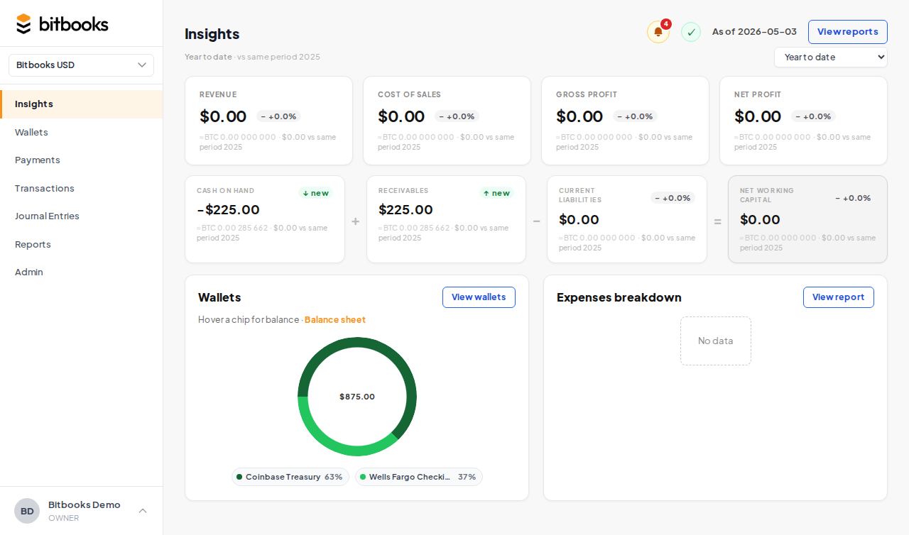
Section 3. Wallet snapshot
A quick view of your wallets and their current balances.
For each wallet, you see:
- Wallet name (e.g., "Blink Lightning Hot")
- Current balance in the wallet's native currency (BTC, USD, EUR, etc.)
- Equivalent in your reporting currency (small text underneath)
- Sync status indicator (synced / syncing / error / never)
Click any wallet to jump to its detail page with full transaction history.
The wallet snapshot shows your top 5 wallets by balance. To see all of them, go to Wallets in the sidebar.
Section 4. Expense breakdown
A donut chart showing where your money went during the selected period.
Each slice is a different expense category (Rent, Salaries, Software Subscriptions, etc.) with a percentage. Hovering over a slice shows the dollar amount.
This view helps you spot two things fast:
- Top expense categories. Where most of your spending lives.
- Surprises. A category you don't expect to be large that suddenly is.
For a deeper analysis, click "View reports" in the page header to open the full P&L.
What "Sample Future Insights" means
If your organization is brand new and has no real transactions yet, the Insights page shows example data so it's not just empty space. You'll see a banner across the top:
Sample Future Insights: these figures are illustrative.
The numbers are fake. They're there to show you what the page looks like once your real data is in. As soon as you connect a wallet or post a transaction, the sample data disappears and your real numbers take over.
Refreshing the data
Insights numbers come from your live database. When you post a new transaction, the dashboard reflects it within a few seconds (the page is computed server-side, then sent to your browser). If you want to force a refresh, just reload the page in your browser.
Performance note
For organizations with thousands of transactions, the Insights page may take a second or two to load when you first open it or when you change the period. This is normal. We're recomputing every KPI from scratch, not relying on a cached number that might be stale.
If it ever takes more than 5 seconds, that's a sign of a real problem and worth contacting support about.
Where to go next
- Reports for a deeper view of any KPI
- Trial Balance if the ledger health icon is red
- Wallets to manage your wallet list
- Activity Log to see recent activity in detail